7 Modern Wall Gallery Ideas For Living Room
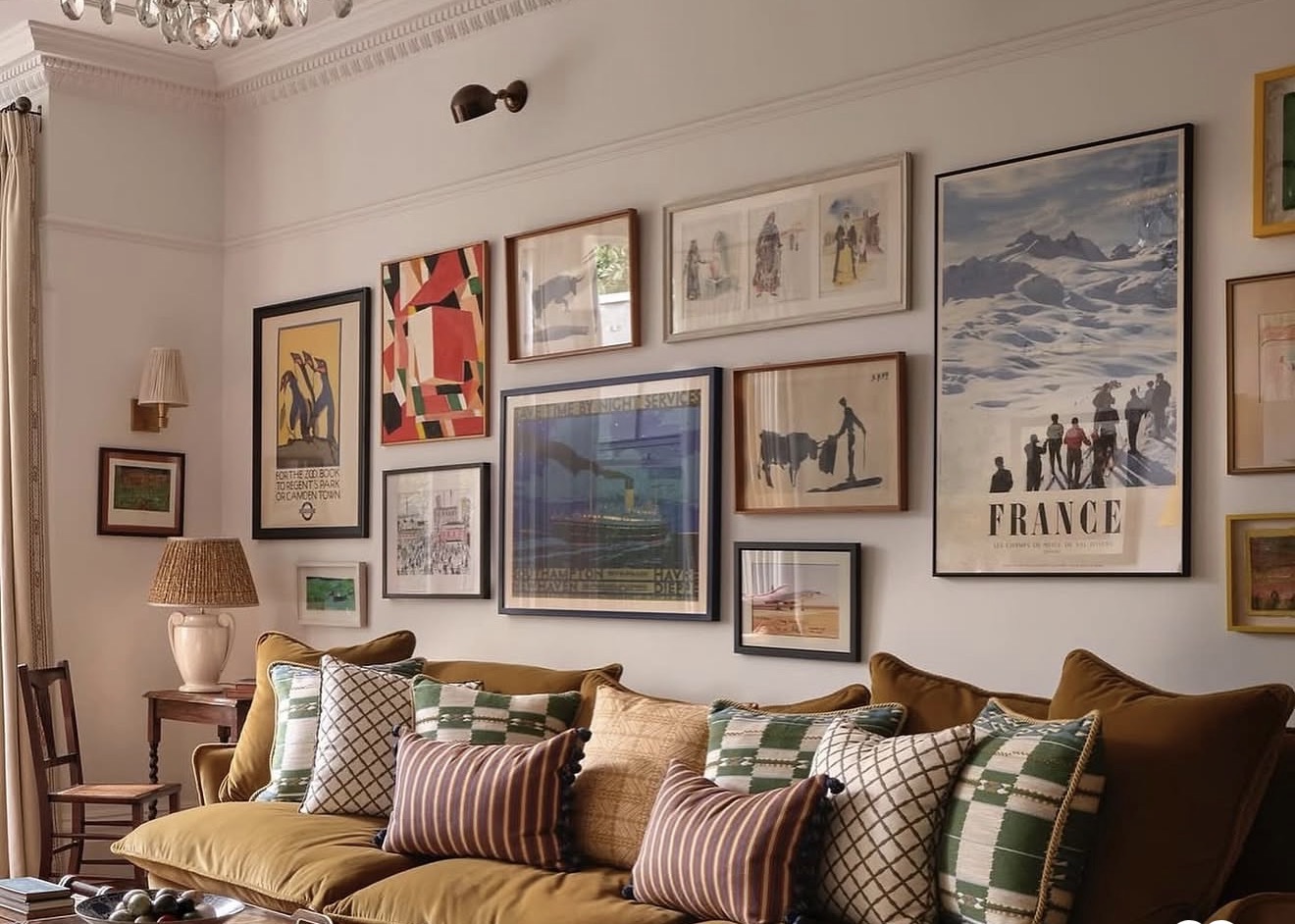
Okay, let’s talk about that one wall in your living room.
You know the one. It’s been blank for months (maybe years, no judgment) and every time you walk past it, you think “I really need to do something about that.”
Same. I’ve been there. And honestly, a gallery wall is one of the easiest ways to fix it without spending a fortune or hiring anyone.
You just need a little direction. That’s where I come in.
Here are 7 modern gallery wall ideas that actually look good, feel fresh, and won’t have your living room looking like every other Pinterest board out there.
1. The Mixed Frame Match
Forget matching frame sets. The modern look right now is all about mixing textures and finishes on purpose.
Think a black metal frame next to a warm wood one, next to something in brushed gold. It sounds like it shouldn’t work, but it totally does.
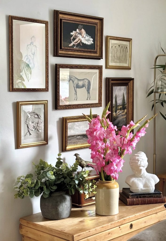
The trick is to keep one thing consistent so it doesn’t look chaotic. Maybe all your frames are thin and simple, or maybe your color palette stays neutral even though the materials change.
That little bit of consistency ties the whole thing together.
This style works so well because it feels collected, not staged.
Like you actually gathered these pieces over time instead of buying a matching kit off a shelf.
2. The Oversized Statement Piece Plus Small Friends
Here’s a layout that’s having a real moment. You take one large piece of art, like something 30×40 inches or bigger, and hang it a little off-center.
Then you surround it with smaller pieces in various sizes.
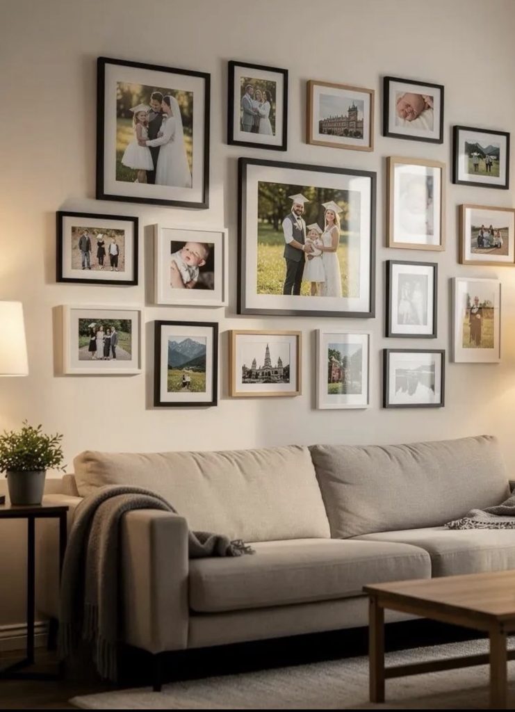
It creates this nice visual hierarchy. Your eye goes to the big piece first, then wanders around to the smaller ones.
It feels intentional and kind of gallery-like, in the actual art gallery sense, not just “gallery wall” as a buzzword.
This is a great option if you already own one piece of art you love but don’t know what to do with.
Build everything else around it.
Learn how to decorate your small living room with small budget
3. The Shelf Ledge Layout
If you’re someone who likes to switch things up seasonally (hi, fellow over-thinkers), this one’s for you.
Instead of hammering nails into your wall for every single piece, install a couple of floating picture ledges instead.
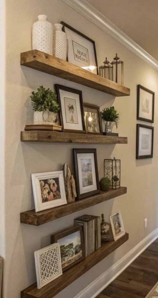
You lean your art and frames against the wall on these shelves, layering pieces in front of each other.
It’s low commitment, easy to rearrange, and honestly kind of fun to style.
Swap in something cozy for fall, something bright for summer, whatever mood you’re feeling that month.
It also gives your wall some depth since pieces aren’t sitting flat. That little bit of layering makes a big difference visually.
4. The Color Block Grid
This one’s for the women who like things clean and organized (again, no judgment, I respect it).
Instead of a random, eclectic mix, you go with a tight grid layout, usually 2×3 or 3×3, using frames that are all the exact same size.
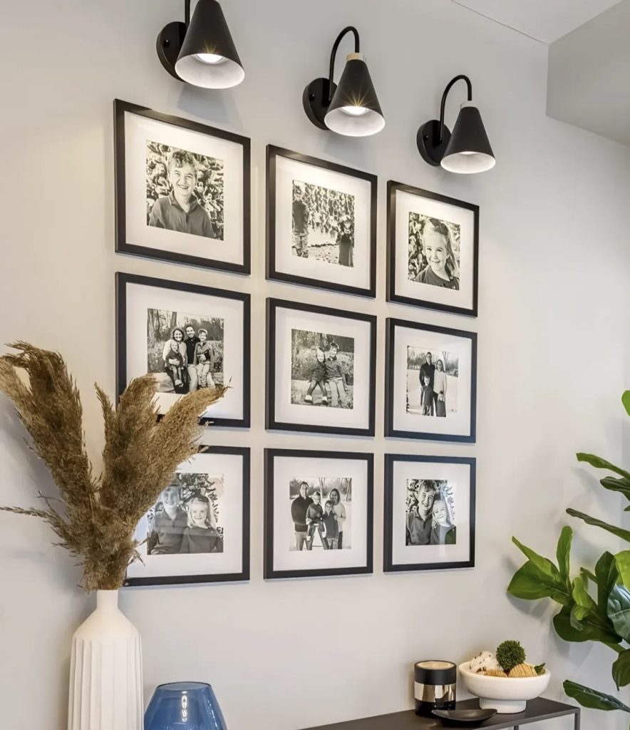
The twist that makes it “modern” and not boring office-lobby energy is choosing art that shares a color story.
Maybe everything has hints of terracotta and cream. Maybe it’s all black and white photography.
Whatever it is, keeping the color palette tight makes the grid feel curated instead of random.
This layout is honestly one of the easiest to plan because the math is simple. Even spacing, even sizes, done.
Discover cozy and latest small living room color scheme ideas
5. The Asymmetrical Cluster
If a strict grid feels too stiff for your personality, this is the move.
You take frames of totally different sizes and shapes, some square, some rectangle, maybe a circle mirror thrown in, and arrange them in a loose, organic cluster.
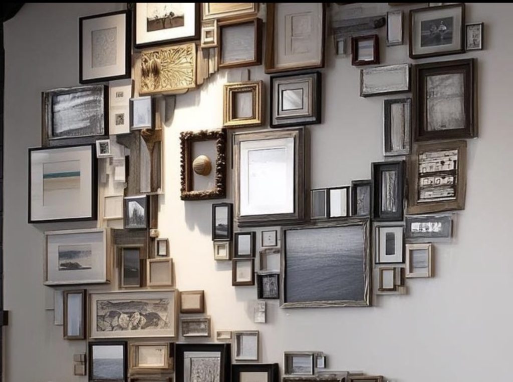
I know this sounds intimidating, but here’s the cheat code: lay everything out on your living room floor first before you put a single nail in the wall.
Move pieces around until it feels balanced, then transfer that exact layout to your wall.
Painter’s tape and paper cutouts are your best friend here too, trace each frame, tape the paper to the wall, and adjust before committing.
This style feels the most “your personality on a wall” out of any option on this list. No two asymmetrical clusters ever look the same.
6. The Mirror and Art Combo
Adding a mirror into your gallery wall mix is such an underrated move.
It’s modern, it’s functional, and it does something magical: it bounces light around the room and makes your whole space feel bigger and brighter.
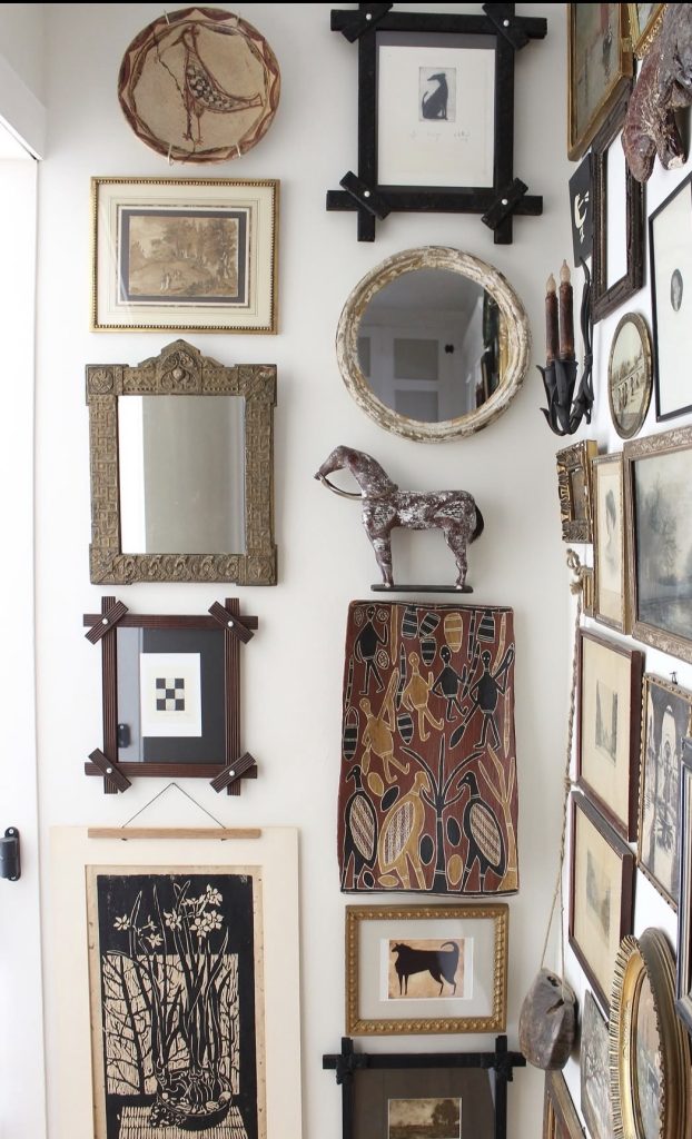
Pick one statement mirror, something with an interesting shape like an arch, circle, or asymmetrical organic form, and mix it in with two or three art pieces around it.
The reflective surface adds a nice contrast against flat printed art and keeps the eye moving around the wall.
This combo works especially well in living rooms that don’t get a ton of natural light. That mirror seriously earns its keep.
7. The Neutral and Textured Wall
This is the softest, most “quiet luxury” option on the list, and it’s everywhere right now.
Instead of bold colors or busy patterns, you go full neutral. Think cream, beige, off-white, warm taupe.
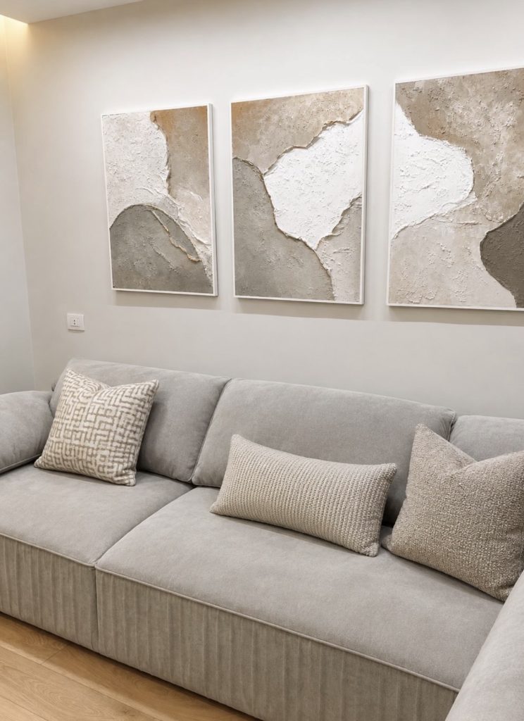
But here’s what keeps it from looking boring: texture. You mix in things like a woven wall hanging, a piece of dried floral art, some subtle abstract prints, and maybe a small ceramic wall sconce or decorative object.
It’s not about color contrast anymore, it’s about material contrast.
This look is having a huge moment because it fits into pretty much any home style, whether your living room leans boho, minimalist, or modern farmhouse. It’s the “goes with everything” option.
You may like these living room and kitchen combo ideas for small spaces.
A Few Quick Tips Before You Start
Before you grab your hammer and go wild, a few things I always tell people:
Measure twice, hang once. Seriously. Use painter’s tape to map out your layout on the wall first. It saves you from a wall full of unnecessary holes.
Eye level matters. The general rule is your art’s center point should sit around 57 to 60 inches from the floor, which is roughly average eye level. If you’re hanging above furniture, like a sofa, leave about 6 to 8 inches of space between the top of the furniture and the bottom of your frames.
Keep spacing consistent. Whether you’re doing a grid or a cluster, try to keep about 2 to 3 inches between each frame. It keeps things from feeling cramped or too spread out.
Don’t rush it. A great gallery wall usually comes together over time. You don’t need to buy every piece in one trip. Start with two or three, live with it, then keep adding as you find things you love.
Final Thoughts
Your living room wall doesn’t have to stay blank forever, and it definitely doesn’t need to be complicated to fix.
Whether you go bold with an asymmetrical cluster or keep it soft and neutral, the best gallery wall is the one that actually feels like you.
Pick whichever style speaks to you most from this list, grab some painter’s tape, and just start playing around.
You’ll be surprised how much life it brings to your space once it’s up there.
Which one of these ideas is calling your name? I’d love to know which style fits your living room best.